Nystrom Website Mockups
Nystrom & Associates Logo

Nystrom & Associates

Nystrom & Associates is a large mental health firm with over 60 locations in 5 states, specializing in counseling and psychiatry. When I joined their team in 2021 as a Designer & WordPress Developer they had a WordPress website which didn't follow accessibility guidelines, UX best practices, and was not properly responsive for mobile devices. Scroll down to see how I tackled these challenges and improved their website's performance to drive business growth.

Roles

  • Product Designer
  • UX/UI Designer
  • Visual Designer
  • WordPress Developer

Building Referral Relationships

Challenge:

Nystrom & Associates receives 200+ online referrals per month, however there isn't any content on the site targeted towards referral partners. I used the results of a questionnaire, sent to referral partners, to define key pain-points when making a referral.

Referral Partner Pain Points:

  • Dissatisfied with appointment wait times from other mental health providers.
  • Unsure how the referral process works.
  • Poor company reputation amongst referral partners.

Solution:

I lead the project and met with our internal team to determine the content and design direction of the page. I designed the prototypes in Figma and developed them using WordPress.

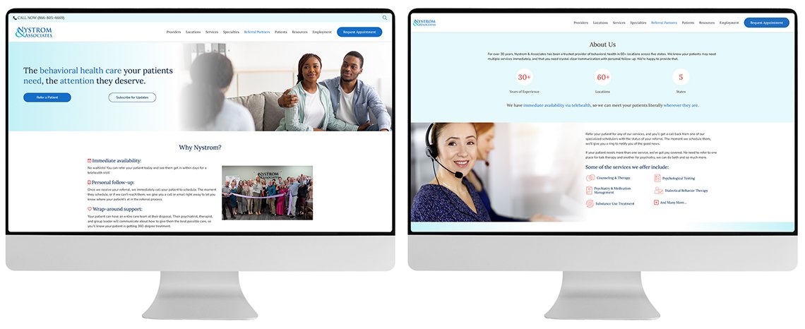
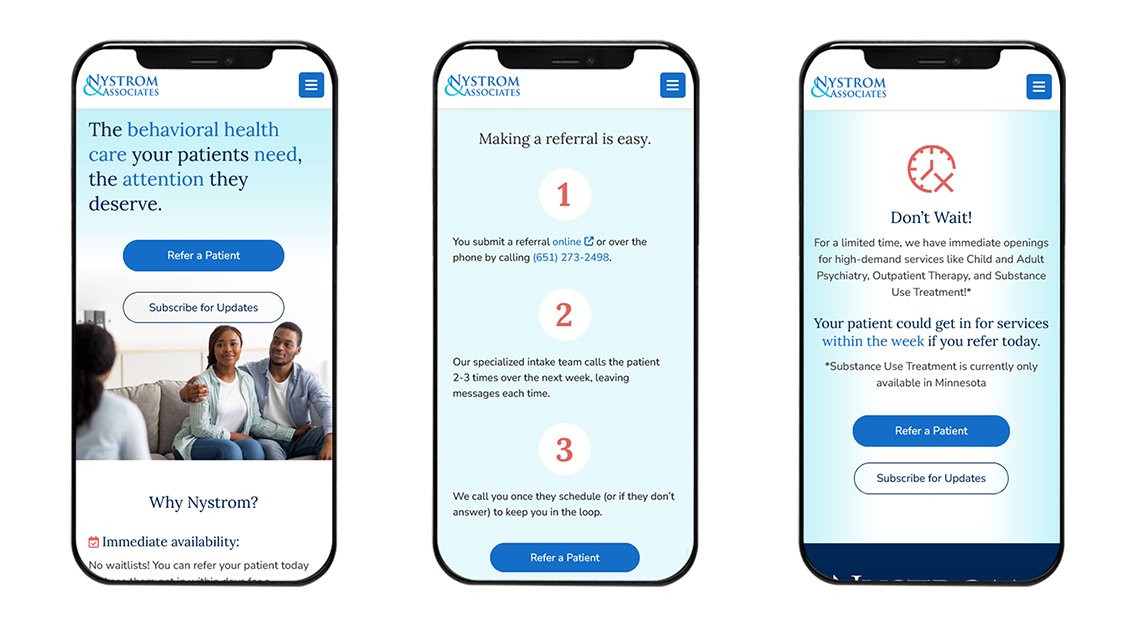
  • Addresses referral partner pain points by featuring immediate availability, how the referral process works, and why they should trust Nystrom & Associates as their preferred referral partner.
  • Generates leads by incorporating an email collector to sign up for a referral newsletter.
  • Features a soft and modern design, with a splash of orange to draw your eye towards important elements. Custom icons make it easy for users to scan the page quickly.

Results:

  • Increased average engagement time by 2 minutes and engagement rates by 12%.
  • 18% increase in online referrals.
Referral Landing Page - Desktop
Referral Landing Page - Mobile

Improving Users Ability to Find Providers

Challenge:

Based on user research and analytics, finding a Provider is the #1 task users seek to accomplish on the website. However, an outdated Provider section had a low engagement rate and was running on a plugin that was no longer supported.

Solution:

I utilized user surveys, competitive analysis, and user testing to design an improved Provider section. I designed the prototypes in Figma and developed them using WordPress.

  • Implemented call to action buttons, allowing users to quickly request an appointment.
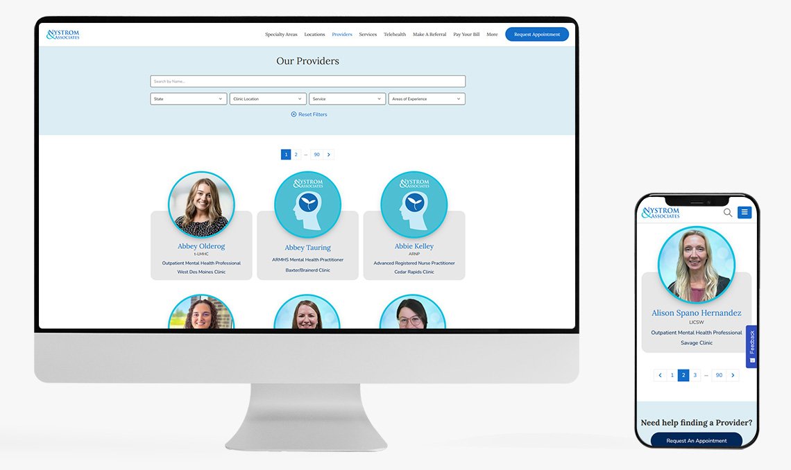
  • Created custom filters for Provider locations, services, and specialties, allowing users to quickly find a Provider that meets their needs.
  • Added clinic information to each Provider's page, giving users quick access to clinic directions and phone numbers, another top task on the website.
  • Added links on services pages, which take you directly to a list of Providers offering that service.

Results:

  • Increased average engagement time by 3 minutes and engagement rates by 15%.
  • 8% increase in appointment requests.
Nystrom & Associates Provider Archive page mockup
Nystrom & Associates Provider Single page mockups on mobile

A Better Way To Find Content

Challenge:

Nystrom & Associate's site has over 3,500 pages and lacked a site search feature. The site had a high drop-off rate, as users often left the site when they couldn't find what they were looking for.

Solution:

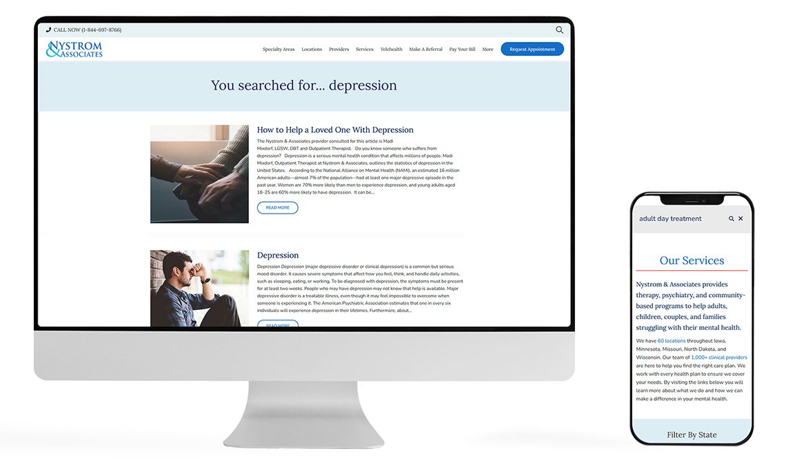
I designed and developed a site search feature, which is both user-friendly and displays the correct content. Over 60% of users will leave a site if they can't find what they're looking for, so properly configuring the site search is vital to user experience.

Results:

  • Increased overall site engagment time by 15% through the use of screen recordings and Google Analytics to identify content that missing from the site.
  • I led our team in creating content that was commonly searched for but not found. Popular queries included "insurance" and "finance".
Nystrom Site Search mockups
Want to see more?