Kilo Strength & Performance

Roles: UX, UI & Visual Designer, WordPress Developer

Project Overview

Kilo Strength & Performance is a Powerlifting gym in St. Paul. They did not have a website, which is critical for people wanting to learn more about the gym before visiting or signing up for a membership. As a member and powerlifter, this was definately a project I was passionate about.

Website Research & Planning

Challenge:

Kilo Strength & Performace opened during the Covid-19 pandemic, when restrictions were placed on gyms and gaining new members was challenging.

Competitive Analysis:

Most local gyms do not have specialized powerlifting and olympic lifting equipment, therby excluding these athletes. Many also have limited hours. Most of their websites also lack an optimized user experience.

Solution:

I created a website which showcases Kilo Strength as a 24-hour member-centered facility, with an all-inclusive and supportive lifting community, where no one feels excluded.
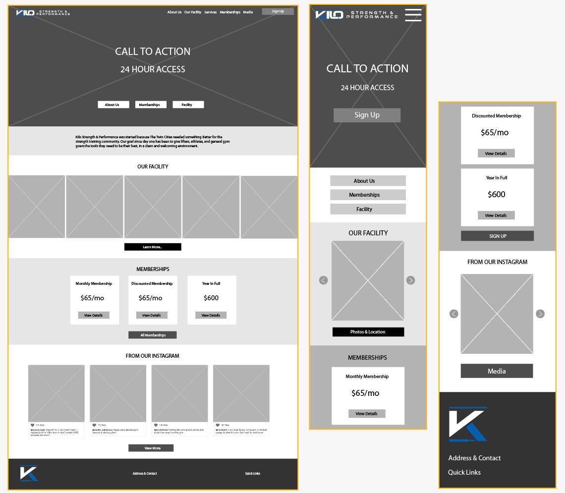
Kilo Strength Wireframes

Testing & Revising to Improve UX

Improvements:

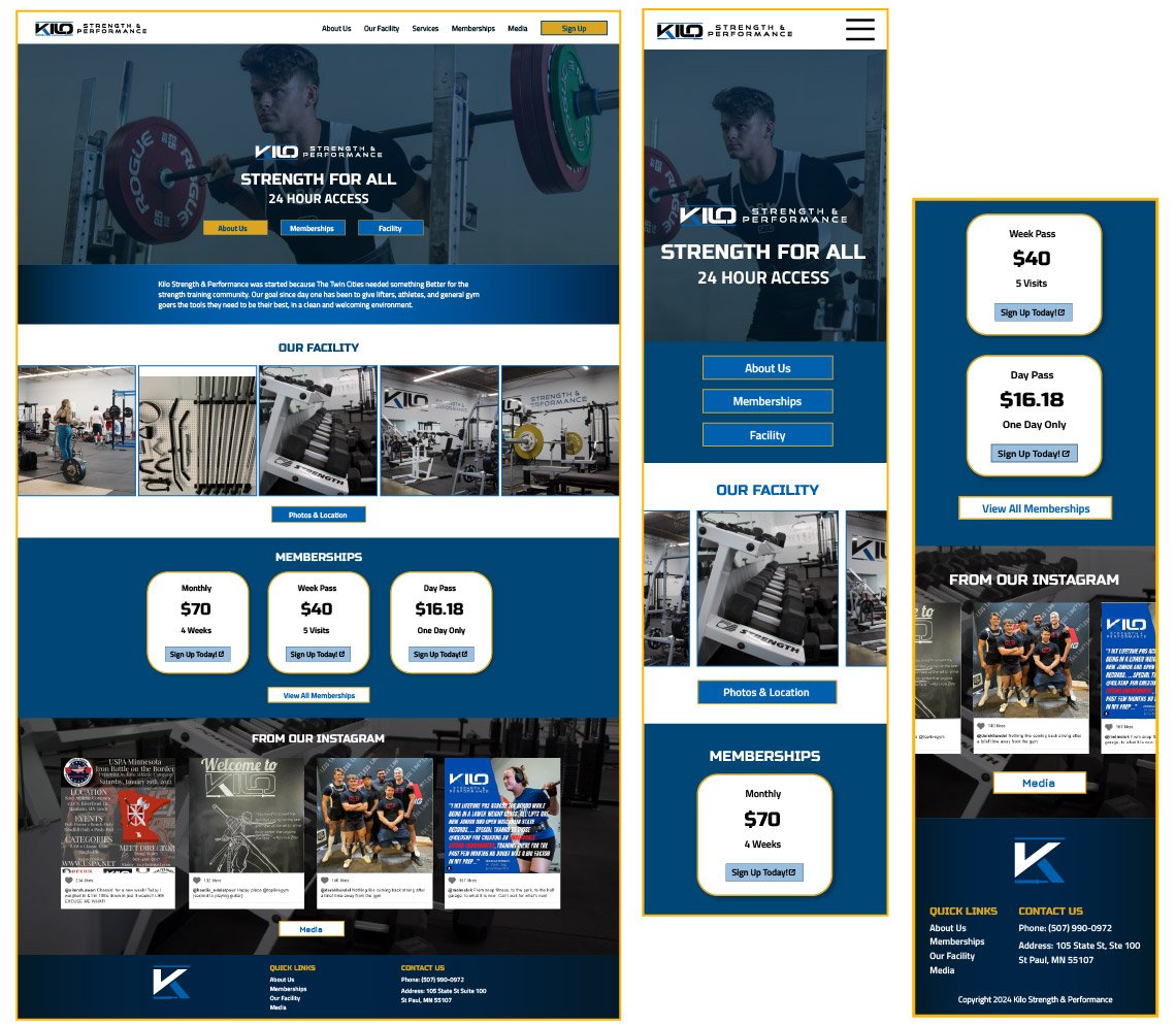
  • As per user testing, the sign up button in the transparent header was hard to notice. I added a white header for ease-of-use and to meet WCAG accessibility guidelines.
  • Users had questions about the length of the monthly and weekly memberships. Descriptions were added to specify the length of each membership option.
  • Implemented a bold blue and gold color scheme to make users feel empowered. I chose bold accent colors to draw users towards desired actions, such as signing up.
  • Added external link icons to buttons and links that open in a new tab.
Kilo Strength Mockups

Bringing the Experience to the User

Challenge:

  • Develop the site using WordPress and a limited budget, without the help of an outside developer.
  • Competition from local gyms with larger marketing budgets and UX teams.

Solution:

  • I developed site using the Genesis WordPress theme, which provides the foundation for responsive design and fast loading times.
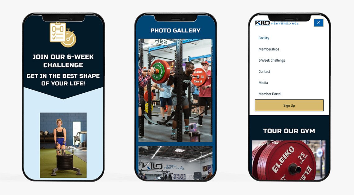
  • Implemented a homepage video banner and a gym tour video, increasing user engagment and conversion rates.
  • Added a prominant "Sign Up" call-to-action menu button, allowing users to sign up from any screen.

Results:

  • 300 new users on the site in 30 days.
  • Conversion rate of ~8% and a user engagement rate of 92%.
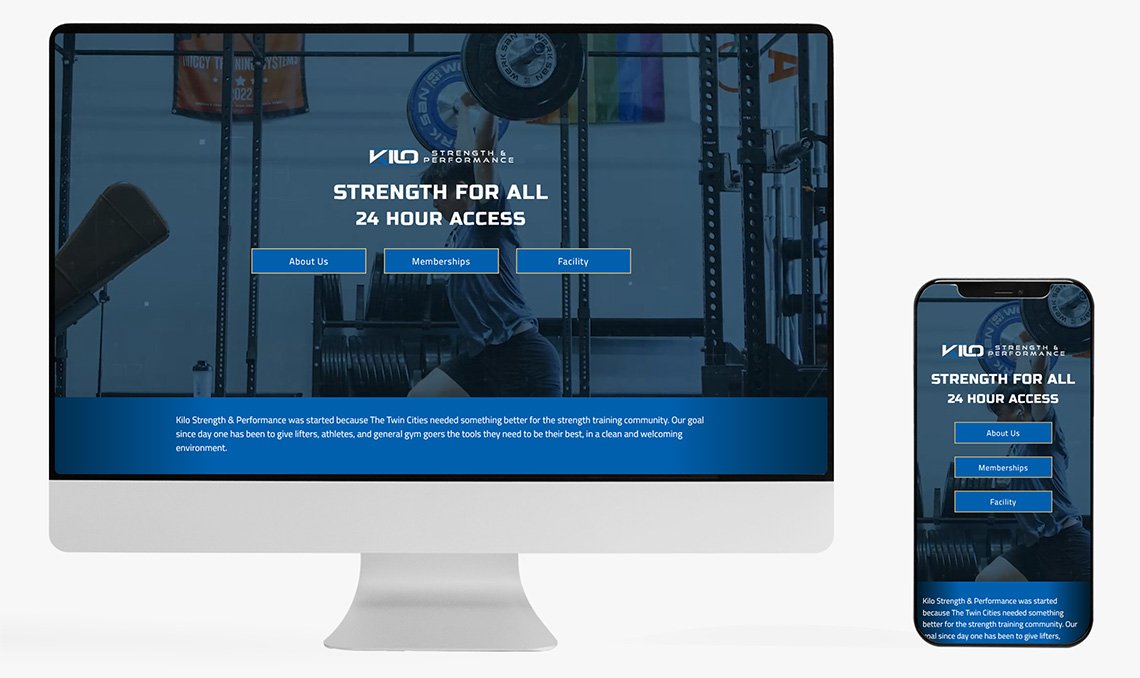
Kilo Strength Website
Kilo Strength Mobile Website
Want to see more?