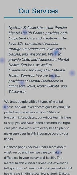
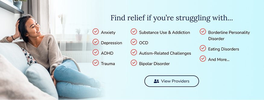
In just over 2 years, Nystrom & Associates grew rapidly from a couple of mental healthcare clinics to 50+ clinics, but its website failed to keep pace. It failed to support key user needs, especially helping users understand and choose the right mental health services.
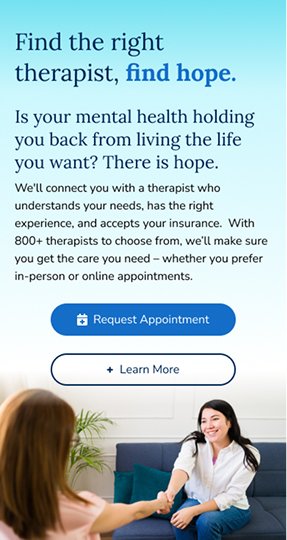
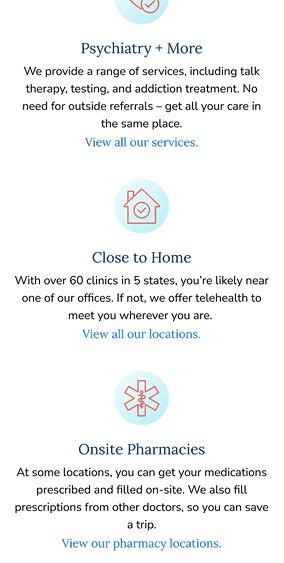
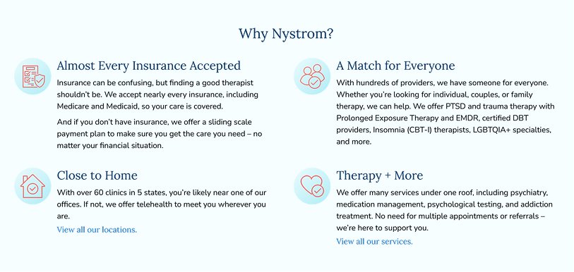
Redesigned service pages that better align with user needs and goals, while reflecting Nystrom's extensive care options, in-person availability, and why users should choose Nystrom for their mental health needs.
Lead UX Designer
3 Months
Mental Healthcare
Brand Researchers, Copywriter, Mental Health Professionals
Usability Review
Patient & Prospect Survey
Competitive Audit
Card Sorting
The original service pages read like clinical documents, long walls of text with clinical language that overwhelmed users. Heatmaps revealed that users didn't scroll past the fold and clickmaps revealed users didn't interact with the text. Only 47% of visitors scrolled far enough to see service information, most left the page immediately, without knowing if the service could help them.
I worked alongside a copywriter to rewrite text using simple, inclusive language every user could understand. The revised copy leads with benefits, builds connection through testimonials, explained the treatment process in 3 easy steps, and incorporated FAQs to answer important treatment questions.
A large-scale survey with over 1,000 participants revealed insurance acceptance and limited in-person availability were the top two pain points when seeking care. Nystrom is uniquely positioned to solve these pain points, as they accept most insurances, Medicare, and Medicaid. With a network of 800+ providers and 60+ locations, accessing in-person care is easy.
Prioritizing insurance logos, acceptance information, and in-person availability addressed users top two pain points, making them more likely to request an appointment.
When survey respondants were asked to select their primary treatment goals 51% selected “Managing symptoms better.” It ranked 3rd among 12 options and was clearly a top driver causing patients to seek treatment.
Including mental health conditions satisfies users desire to manage symptoms, while providing reassurance that Nystrom helps improve their day-to-day living.
After reviewing Nystrom's top four competitors, only one developed a unique selling point. All competitors emphasized online appointments, provider availability, and insurance acceptance, but failed to address a key question: why should visitors make an appointment with you?
Nystrom offered a depth of services far greater than its competitors, such as dialectical behavioral therapy and substance use treatment. 800+ providers meant there was a match for almost everyone. 60+ clinics in 5 states and online treatment options gave users flexibility to choose how they received care.
Creating a “Why Nystrom” section differentiates them from their competitors and focuses on Nystrom's unique strengths, such as their wide range of services.
While observing users through screen recordings and heatmaps, I noticed frequent back-and-forth navigation and heavy reliance on search. Users were confused and didn't know how to find what they were looking for. It was a frustrating experience, especially for anyone already struggling with their mental health. I conducted a card sorting test with 10 participants to reorganize the site's navigation, helping them reach their goals faster.
After implementing the new navigation, the site saw a lower bounce rate, fewer quick click-backs, and increased usage of the menu over the search function. The new navigation helped users accomplish their goals on the site.
Wireframes were designed in Figma for 8 key service pages. Important features included: short service introductions, call-to-action buttons, insurance details, what to expect sections, and frequently asked questions.
Wireframes were reviewed with the marketing team for approval. After the review process, they were handed off to the copywriter. I worked alongside our copywriter and several mental health professionals to ensure accuracy and healthcare compliance.
The visual design featured a clean, bright design, paired with uplifting imagery, highlighting the positive outcomes of mental health treatment. The new design intentionally shifted focus away from the stigma and negative perceptions associated with seeking care. It also aligned with Nystrom's mission statement to “become the best version of yourself.”
The photography emphasized inclusivity, such as LGBTQIA+ patients, disabled patients, and other diverse communities Nystrom served.
I developed the designs in WordPress, leveraging my experience as a WordPress developer.
“I chose Nystrom because the website was easy to use and the colors inspired me, unlike other websites I had visited.”
- Client Requesting an Appointment