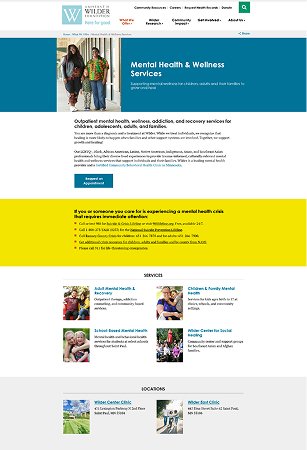
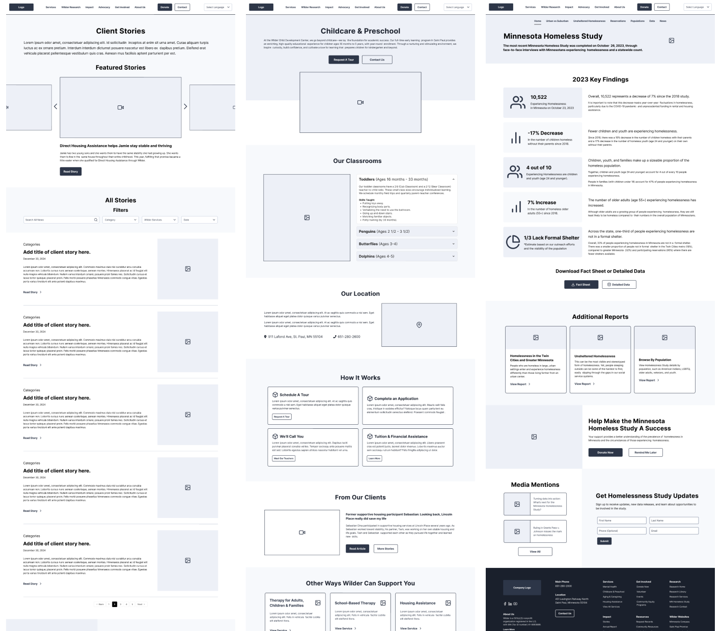
With 30+ mental health and financial assistance programs, 1,500+ research articles, and vastly different user needs, the site tried to accommodate everyone all at once, resulting in text-heavy pages, confusing navigation, and fractured user flows.
A redesigned website that clearly communicates Wilder's programs and services to each distinct audience, while driving donations, volunteer sign-ups, and research partnerships.
Lead UX Designer
6 Months
Nonprofit, Healthcare, Community Research
UX Researchers, Art Director, Content Designer, Developers
Usability Review
Competitive Audit
Stakeholder Interviews
Focus Groups
Usability Testing
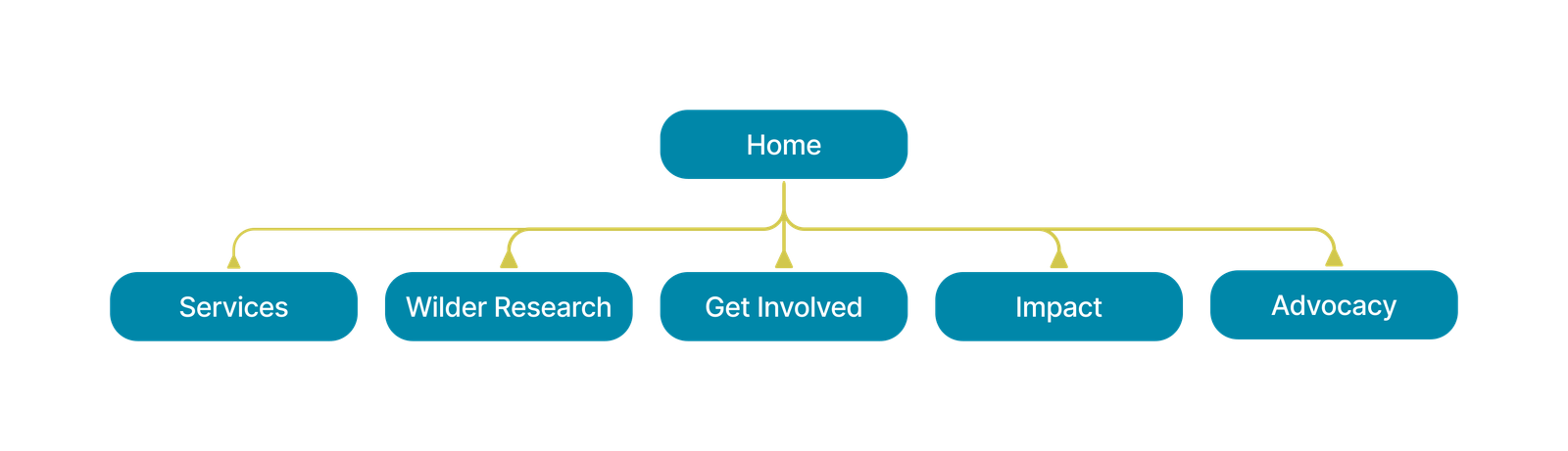
Wilder Foundation has four distinct user groups: those seeking services, volunteers, donors, and social service researchers.
High drop-off rates meant users were missing critical information, such as how to request an appointment. Lack of visual hierarchy meant users didn't know where to look. Over 30% of users quickly navigated backwards after visiting a new page, a sure sign they didn't find what they were looking for.
Without defining their audiences, the site tried to tell visitors everything, but instead told them nothing. After categorizing users as service-seekers, volunteers, donors, or researchers, what to include on each page became clear.
After reviewing 3 competitor websites, I noticed many sites failed to include data supporting their effectiveness. Wilder is unique, they have the research data that convinces visitors their donations will create lasting change.
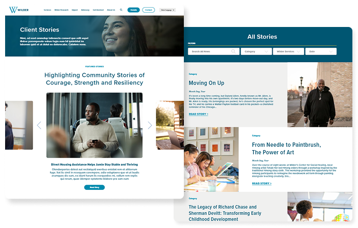
Most competitor sites lacked testimonials and social proof, failing to build empathy with users. Wilder had collected in-depth testimonials from clients, a necessary component if they wanted to build trust and empathy with users.
Incorporating statistical proof, testimonials, and case studies builds both trust and empathy, improving the odds of visitors making a donation — a primary business goal for the redesign.
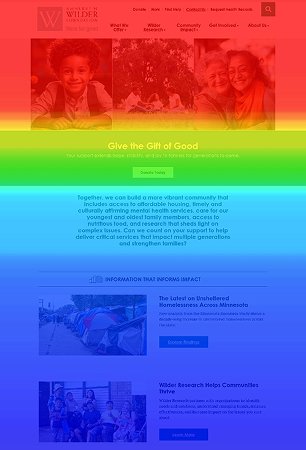
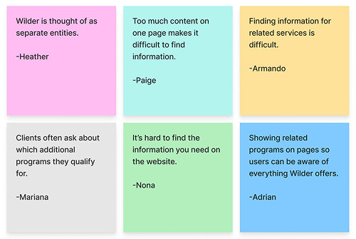
Interview participants agreed both clients and employees get lost when viewing the site. Clients are unaware of the wide range of services, related programs, or which programs they qualify for. Heatmaps confirmed, since visitors were't engaging with or scrolling through key service pages.
Adding descriptive headlines, eligibility summaries, and related service links made Wilder's programs easier to understand, helping more people find the support they need.
Most clients don't understand Wilder's services and only know part of the services we offer. The site doesn't explain what Wilder does.
- Armando, CEO
Wilder's clients include those seeking services, donors, volunteers, and researchers, each visiting the site with different goals. Focus groups revealed the existing site forced every visitor through a singular user flow and analytics confirmed showing high drop-off rates.
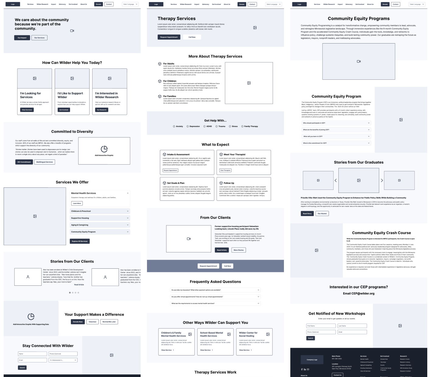
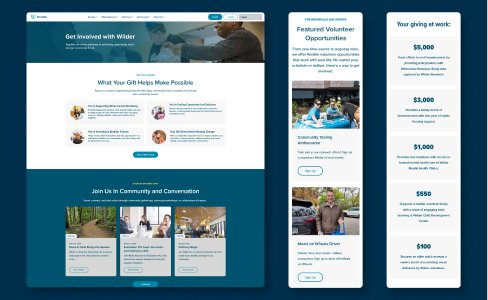
Segmenting content by audience guides visitors toward key actions, such as requesting appointments, making donations, or exploring volunteer opportunities.
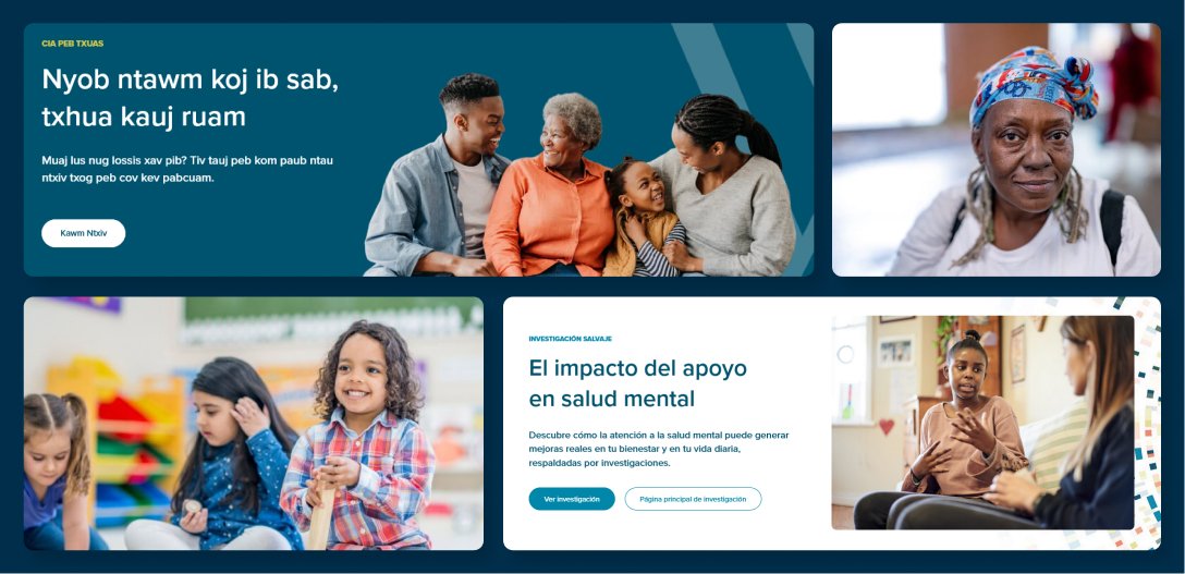
Participants emphasized Wilder is deeply rooted in community, but the design lacked an authentic representation of who Wilder served. Stock photography, technical jargon, and an English-only site didn't meet user needs.
Adding community-sourced photography, inclusive plain-language copywriting, and multilingual support creates a more inclusive experience for Wilder's diverse audience.
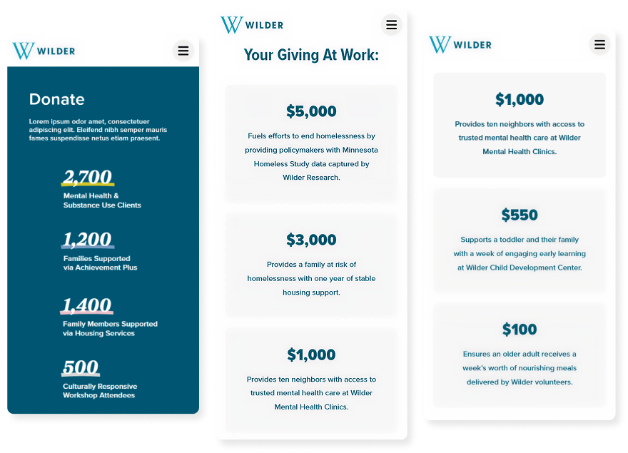
Donor focus group participants agreed that Wilder's individual and systematic impact wasn't well understood. They stated average donors want to know what their donation buys and large donors are more interested in Wilder's systemic impact.
Featuring Wilders total impact appeals to large donors, while featuring “Your Giving at Work” shows average donors what their donations are being used for.
I want to know that my $100 buys 10 Meals on Wheels for my community... I think that would be very motivating for people to connect with.
- Focus Group Participant
A low-fidelity prototype was developed from the wireframe designs, incorporating key interactions such as pop-up modals and forms. Two usability studies, one with service seekers and another with researchers, helped uncover opportunities for improvement.
FAQs weren't enough, eligibility for certain programs, like housing assistance, were still unknown.
Contact information and online forms were prominently showcased, giving users effortless access to critical information.
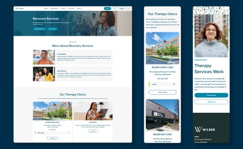
Participants couldn't find basic clinic information, which they needed prior to scheduling an appointment.
Prominently linking to location details gives users immediate access to addresses, phone numbers, hours, services offered, and more.
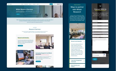
Researchers wanted to stay connected with Wilder Research.
Incorporating a "Subscribe to our Newsletter" section gives researchers early access to research studies, important events, and company updates.
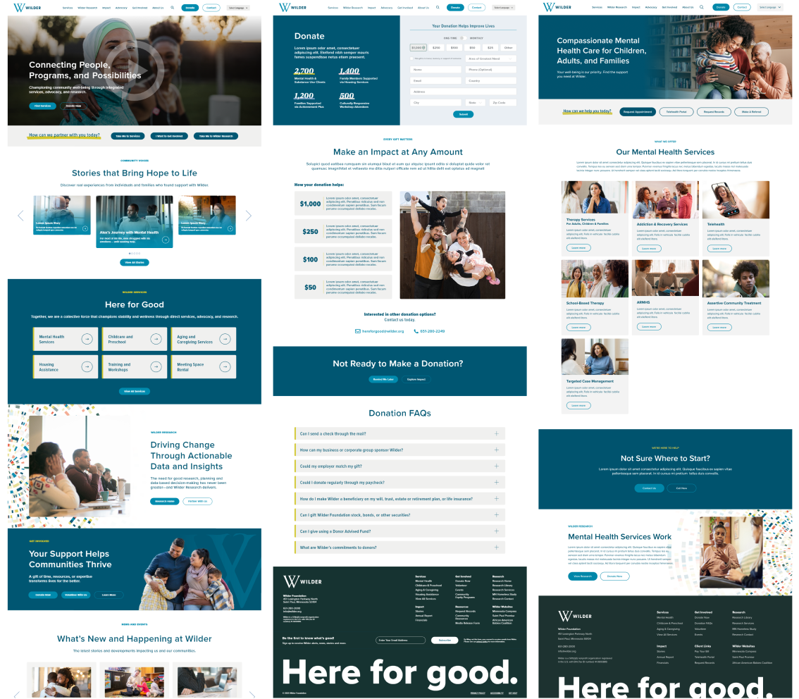
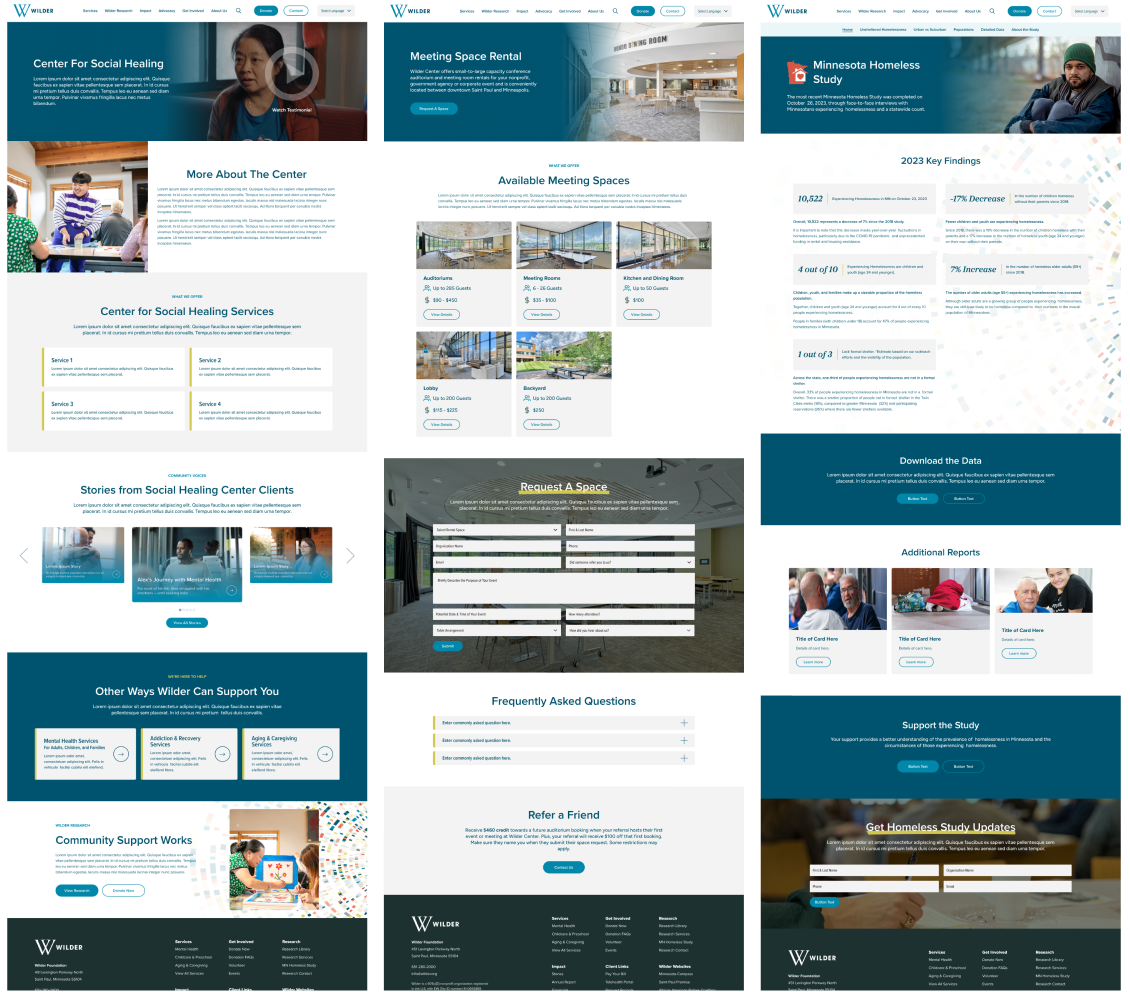
Wilder's extensive website includes over 2,000 pages and 1,500+ research articles. A cohesive design system was created to ensure visual consistency and accessibility between pages.
The reimagined Wilder brand establishes a unified visual identity, strengthens emotional connections, and fosters an inclusive environment. It supports a seamless “One Wilder” experience by itegrating Wilder's various departments.
Designs were handed off to the development team for implementation in WordPress. I supported the development team, leveraging my previous experience as a WordPress developer.
I like how you can easily understand all of our services and the popup forms are super easy to use.
- Usability Testing Participant
Mental health page views increased by 50%. Visitors spent an average of 45 seconds on each page. Appointment requests converted at 4%, above the 2.5% industry average, supporting Wilder's primary goal of increasing mental health leads.
Donation page views increased by 29%, while users grew by 35%. Volunteer pages saw higher growth with volunteer page visits increasing 173%. Featured volunteer opportunities were the most popular links, achieving Wilder's goal of increasing volunteers.
Research pages saw a 30% increase in users, while engagement rates increased by 5%. Advanced research search options, such as searching by researcher name, emerged as the most-used feature for finding reports and publications.